📍 Based out of Tampa
June 27th, 2024
Designed a User-Friendly Crypto Banking Experience | Cryptonic
Overview
-
I designed a crypto banking app focused on making cryptocurrency management straightforward for everyone. I created both mobile and desktop landing pages to ensure easy access and encourage downloads across devices. Through feedback and iterative improvements, I simplified complex features to create an app that feels approachable and practical for users.
Problem
-
Many crypto platforms are complex and can feel overwhelming for newcomers, making it difficult for everyday users to get started. This complexity often creates a barrier to entry, especially for people unfamiliar with cryptocurrency, who may need simpler tools to manage their assets confidently.
Project Goal
-
My goal was to design a crypto banking app that would simplify cryptocurrency management for both beginners and seasoned users. By focusing on clarity and ease of use, I aimed to create an app that anyone could navigate and utilize without a steep learning curve.
Design Process/Style Guide
-
Planning & Wireframing
-
I focused on prototyping the home page because it’s the first screen users interact with, shaping their entire experience. By refining this entry point, I ensured essential features were front and center, allowing users to quickly grasp the app's purpose. This approach helped create an intuitive, streamlined experience without added complexity.
-
-
Typography and Color Palette
-
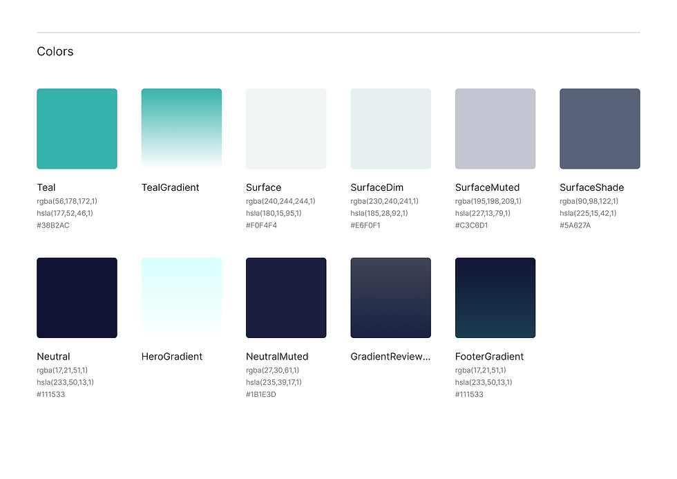
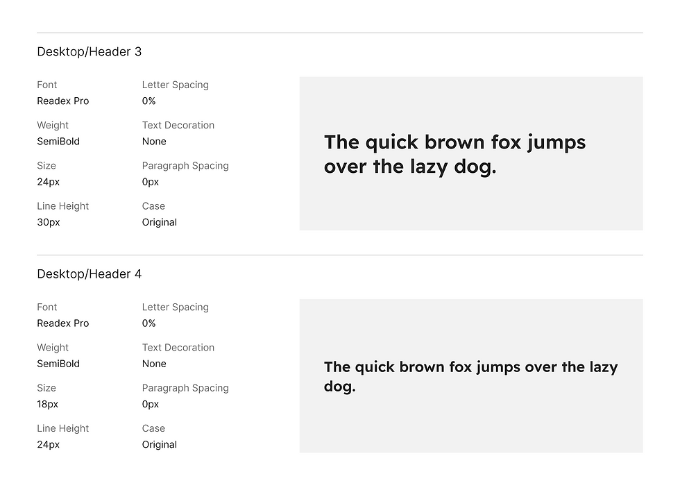
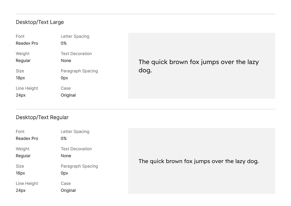
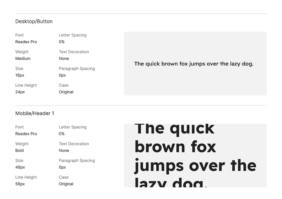
I chose Readex Pro as the primary font for its clean, modern look and easy readability, which aligns well with the app’s goal of accessibility. For the color palette, I used #38B2AC as the main color—a teal that promotes a sense of trust and reliability. This minimal palette kept the interface uncluttered, focusing users’ attention on essential actions and content.
-

-
Landing Page Design (Desktop & Mobile)
-
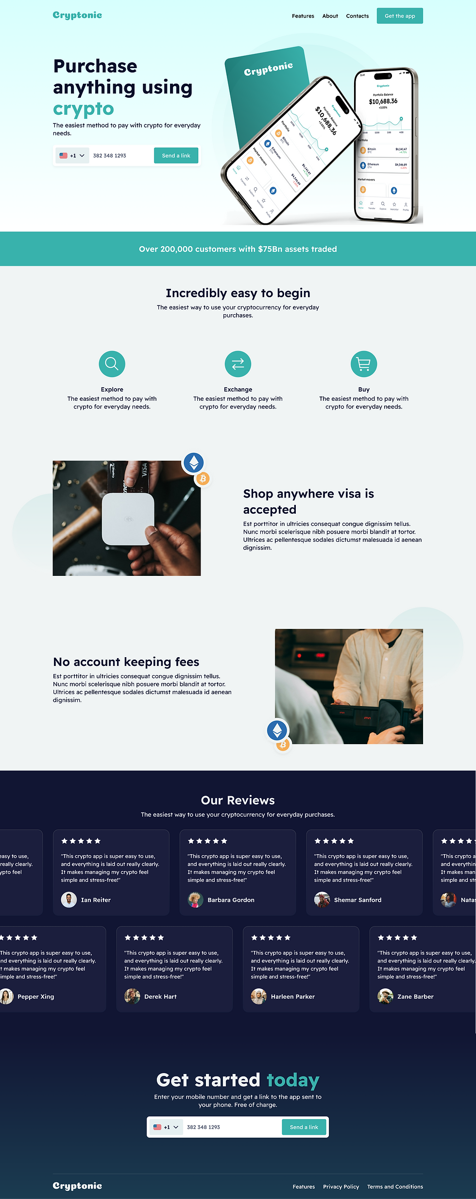
To support easy access, I created both desktop and mobile landing pages geared toward encouraging app downloads. The layout directs users smoothly to download options, ensuring they can access the app easily from any device, whether they’re at home or on the go.
-
Desktop View:
Mobile View:
-
Click on the Prototype below to interact with the mobile version of the landing page.
Final Design
-
The home page was designed to provide a straightforward, welcoming entry point for users. Key features are clearly displayed to ensure users can access essential functions with minimal effort. With Readex Pro as the typography, the text is clear and legible, complementing the clean layout and enhancing readability. The primary color, #38B2AC, guides users’ focus to important elements without overwhelming the screen.
-
Play with the prototype below:
Challenges & Solutions
-
Challenge: Simplifying Complex Information
Solution: I focused on a clean layout, highlighting core actions to make essential features easily accessible for users without overwhelming them. -
Challenge: Ensuring Consistency Across Devices
Solution: I designed responsive desktop and mobile landing pages with cohesive layouts and clear calls-to-action, making it easy for users to access the app from any device.
Conclusion
-
This project taught me a lot about designing for accessibility within a technical space. By refining the home page to present key functions intuitively and creating consistent landing pages, I was able to develop a crypto banking experience that is straightforward and engaging. This approach ensures that users of all experience levels can easily manage their cryptocurrency, meeting their needs in a clear, accessible way.
Overview
-
I designed a crypto banking app focused on making cryptocurrency management straightforward for everyone. I created both mobile and desktop landing pages to ensure easy access and encourage downloads across devices. Through feedback and iterative improvements, I simplified complex features to create an app that feels approachable and practical for users.
Problem
-
Many crypto platforms are complex and can feel overwhelming for newcomers, making it difficult for everyday users to get started. This complexity often creates a barrier to entry, especially for people unfamiliar with cryptocurrency, who may need simpler tools to manage their assets confidently.
Project Goal
-
My goal was to design a crypto banking app that would simplify cryptocurrency management for both beginners and seasoned users. By focusing on clarity and ease of use, I aimed to create an app that anyone could navigate and utilize without a steep learning curve.
Design Process/Style Guide
-
Planning & Wireframing
-
I focused on prototyping the home page because it’s the first screen users interact with, shaping their entire experience. By refining this entry point, I ensured essential features were front and center, allowing users to quickly grasp the app's purpose. This approach helped create an intuitive, streamlined experience without added complexity.
-
-
Typography and Color Palette
-
I chose Readex Pro as the primary font for its clean, modern look and easy readability, which aligns well with the app’s goal of accessibility. For the color palette, I used #38B2AC as the main color—a teal that promotes a sense of trust and reliability. This minimal palette kept the interface uncluttered, focusing users’ attention on essential actions and content.
-


-
Landing Page Design (Desktop & Mobile)
-
To support easy access, I created both desktop and mobile landing pages geared toward encouraging app downloads. The layout directs users smoothly to download options, ensuring they can access the app easily from any device, whether they’re at home or on the go.
-
Desktop View:

Mobile View:
-
Scrollable prototype available on desktop version only
Final Design
-
The home page was designed to provide a straightforward, welcoming entry point for users. Key features are clearly displayed to ensure users can access essential functions with minimal effort. With Readex Pro as the typography, the text is clear and legible, complementing the clean layout and enhancing readability. The primary color, #38B2AC, guides users’ focus to important elements without overwhelming the screen.
-
Interact with final prototype on desktop version
Challenges & Solutions
-
Challenge: Simplifying Complex Information
Solution: I focused on a clean layout, highlighting core actions to make essential features easily accessible for users without overwhelming them. -
Challenge: Ensuring Consistency Across Devices
Solution: I designed responsive desktop and mobile landing pages with cohesive layouts and clear calls-to-action, making it easy for users to access the app from any device.
Conclusion
-
This project taught me a lot about designing for accessibility within a technical space. By refining the home page to present key functions intuitively and creating consistent landing pages, I was able to develop a crypto banking experience that is straightforward and engaging. This approach ensures that users of all experience levels can easily manage their cryptocurrency, meeting their needs in a clear, accessible way.
June 27th, 2024
Designed a User-Friendly Crypto Banking Experience | Cryptonic


